PLAKAT SAMMLUNG
timeline — 1 week
roles — photography, type design, poster design
supervision — Jiri Oplatek
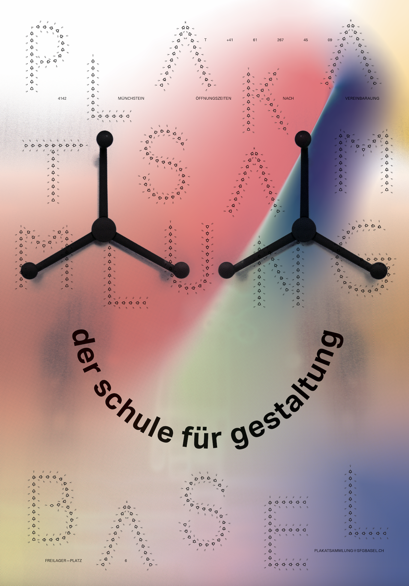
I was tasked to make a poster for a poster collection. Since this was in Basel, the full name of the poster archives, Plakat Sammlung der Schule Fur Gestalung Basel, had to be feautred somewhere on the poster. This translates to “Poster Collection for the Basel School of Design”.
Constraints: Laserprinted, Welt format; 128 × 90.5 cm
Initial Drafts︎︎︎
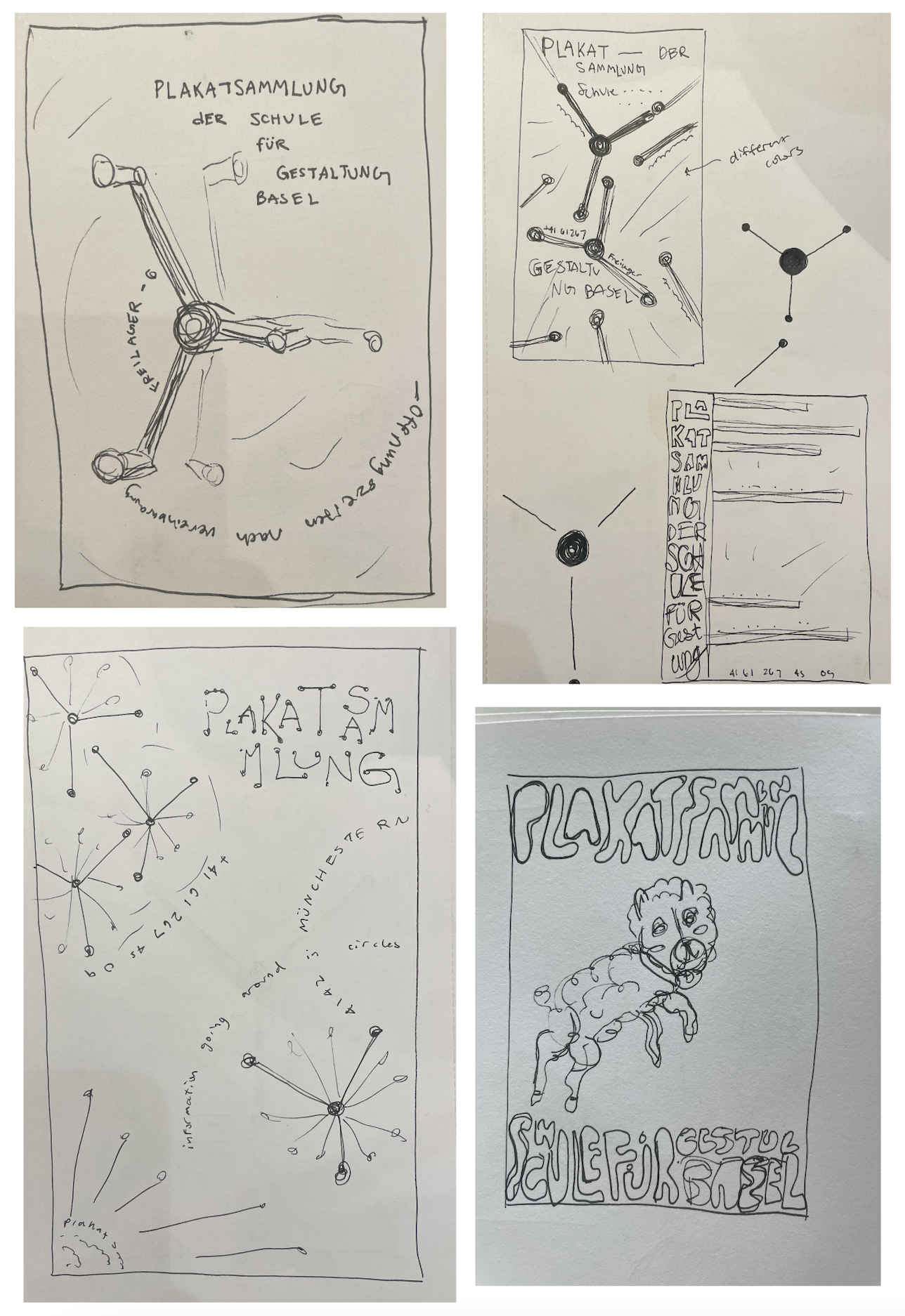

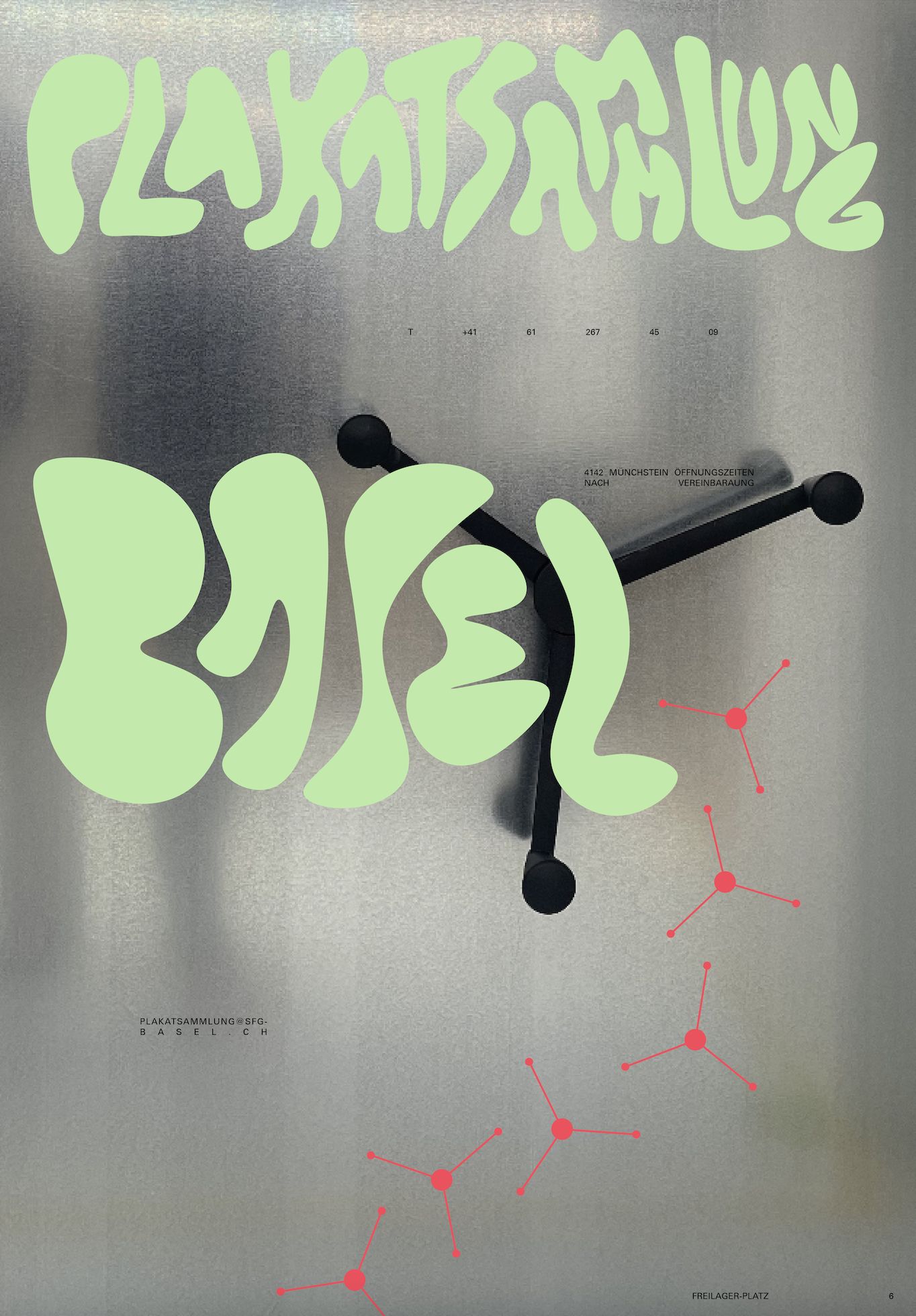
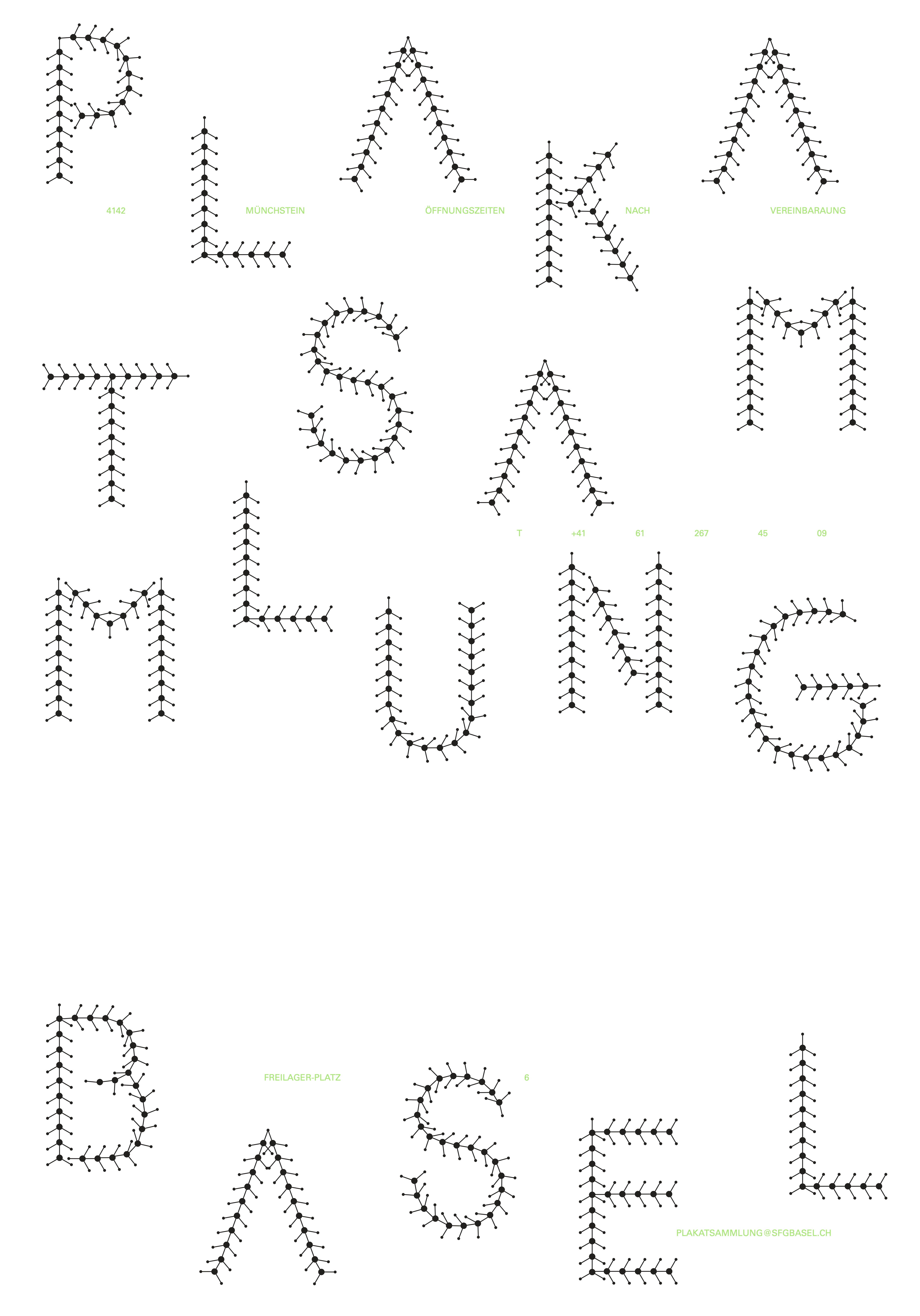
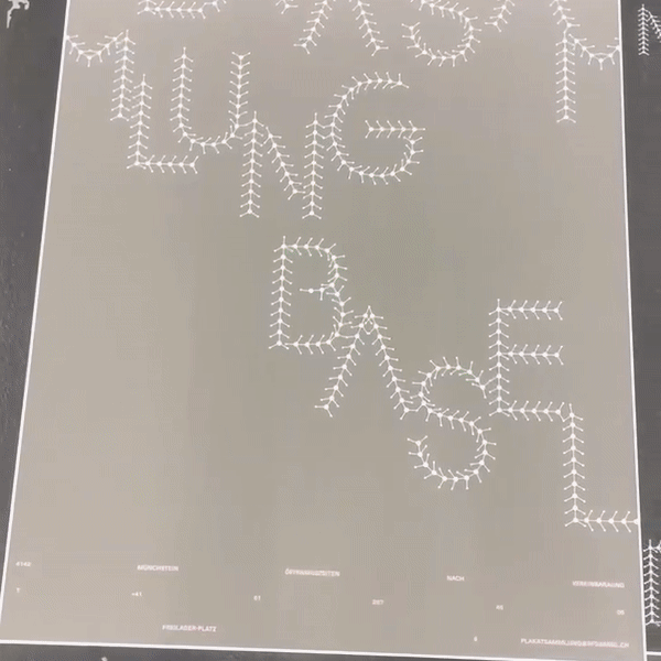
I decided I wanted to go through with the idea of the last poster in this series, this entailed a custom typeface created from the small wheels in which the archives were controlled from that stored the posters in the physical location we toured.

I then decided I wanted to include photography from the archives, so the wheel symbol in the type can make sense to the viewer, without having to have outside knowledge of the archives.
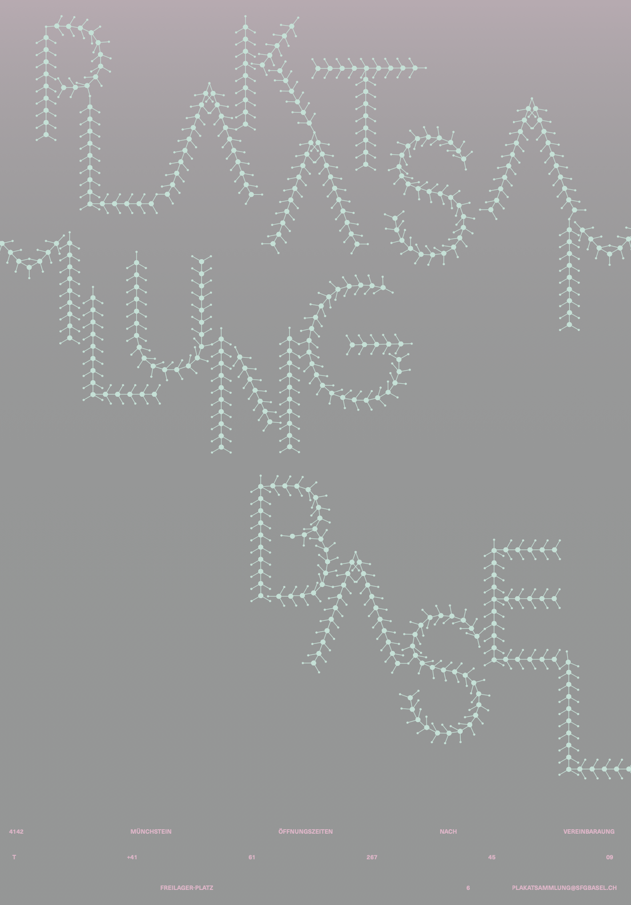
The Welt format being so big, I noticed with each print that the resolution had to be in halftone so upon closer look, the resolution would be comprised of small dots.
I followed the 30-10-3 rule with this poster, or as Jiri called it, musuem viewing (up close) versus eye catching (glimpsing on the street). I wanted this poster to be interesting from 30 feet away, 10 feet away, or 3 inches away.
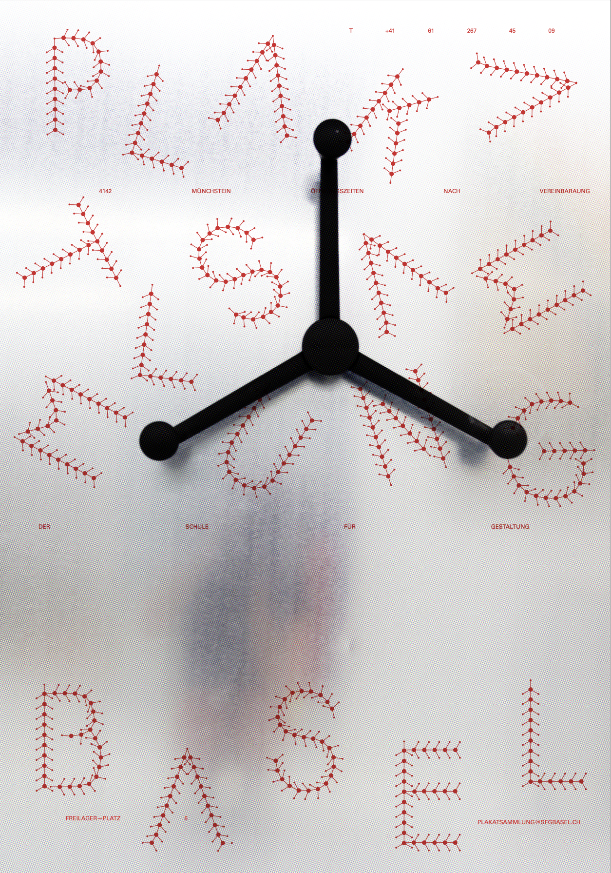
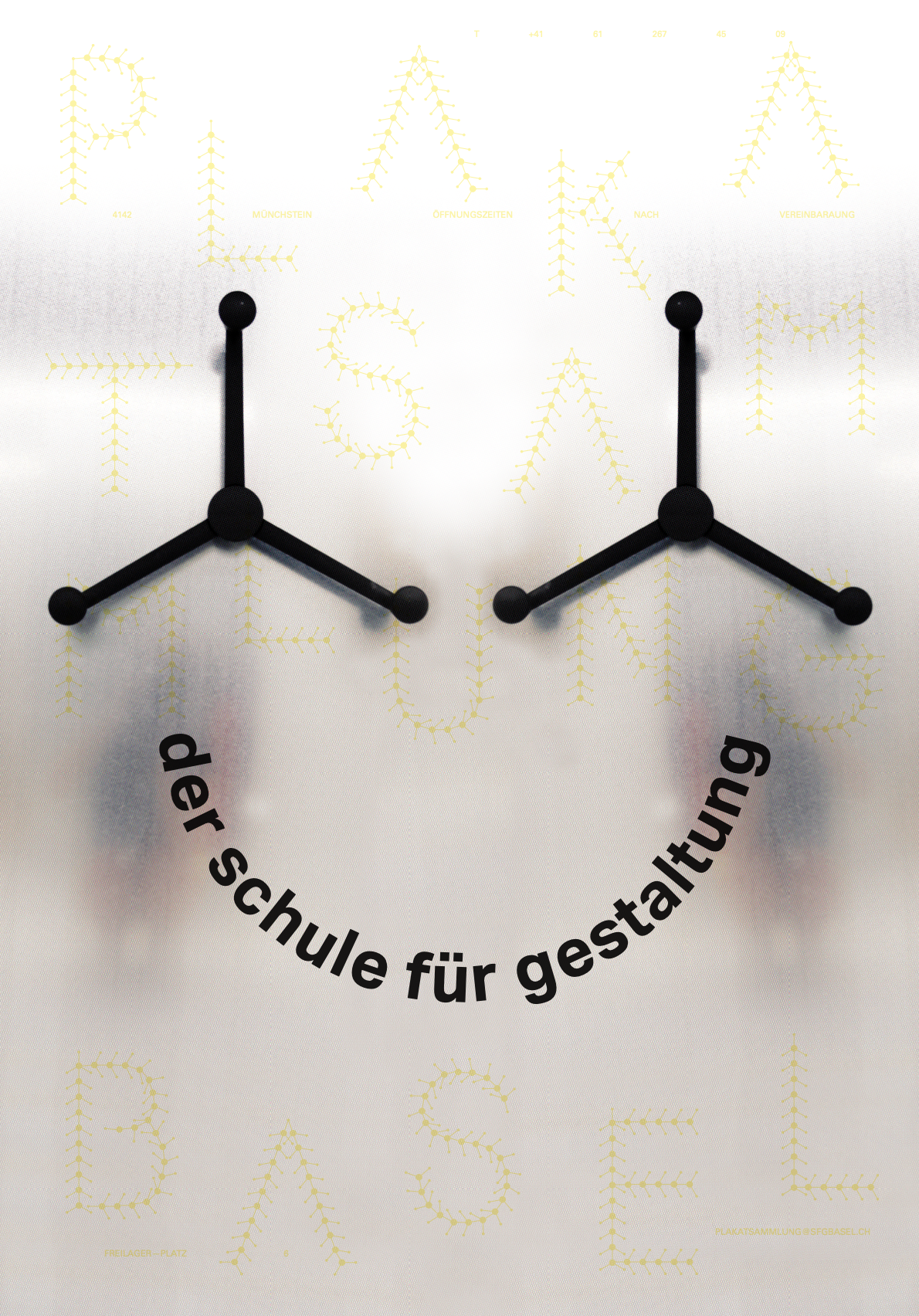


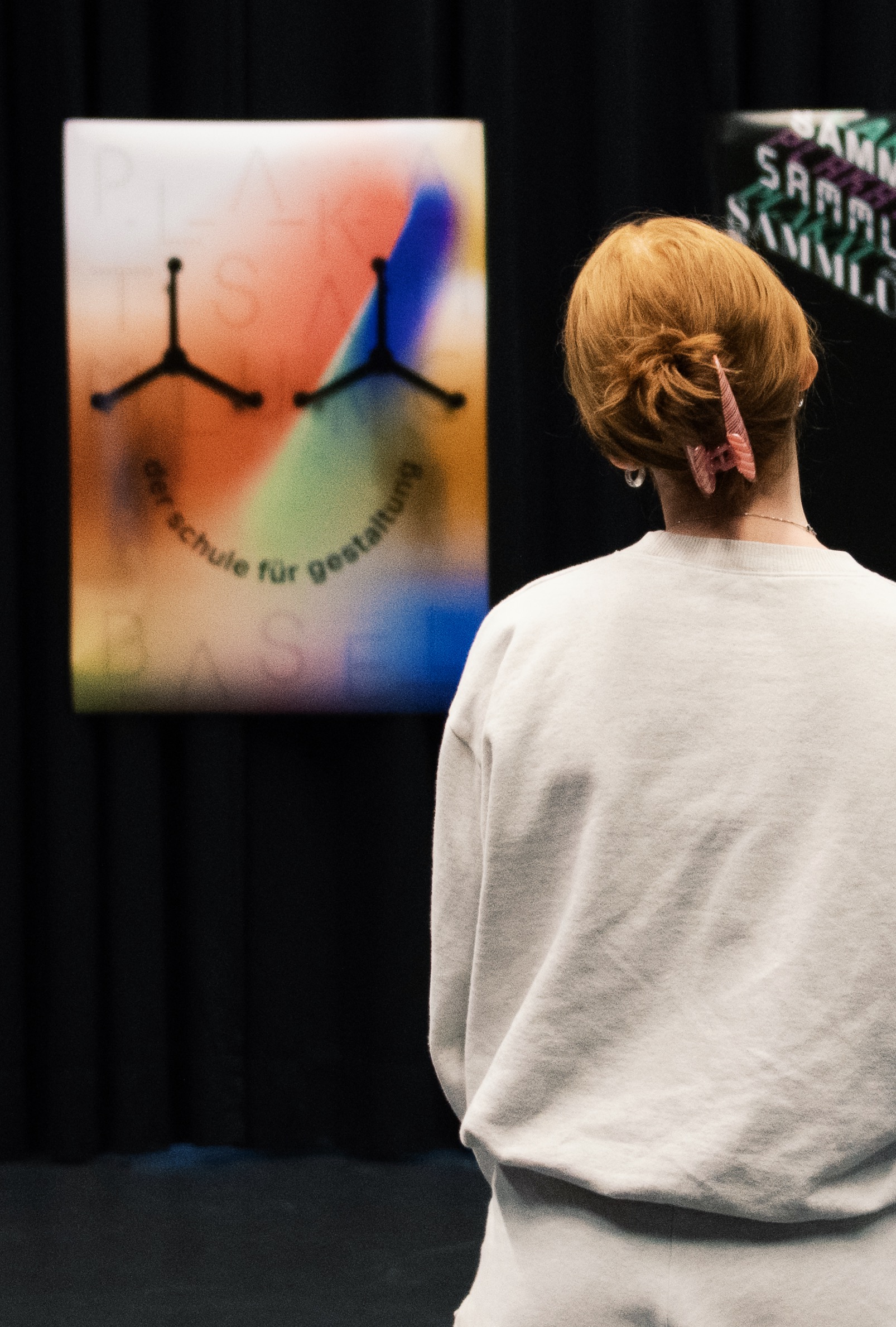
The final smiley face was a nod to the original symbol in graphic design, and to overall allude to the happy nature of the poster collection in Basel!
Cheers.